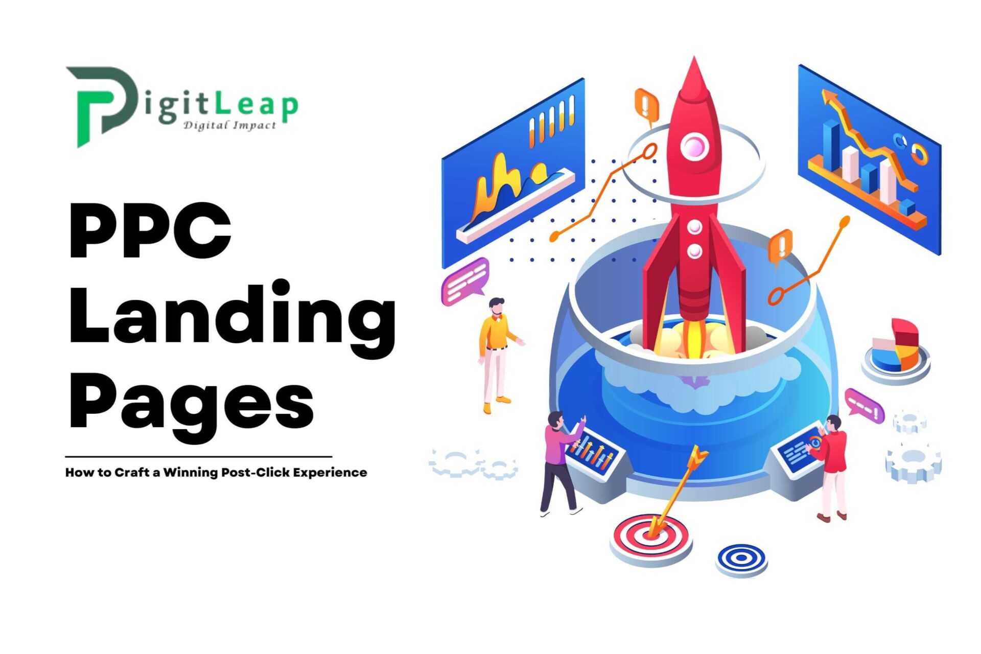
PPC Landing Pages: How to Craft a Winning Post-Click Experience
In the world of Pay-Per-Click (PPC) advertising, getting clicks is only half the battle. What happens after users click on your ad is equally, if not more, important. Crafting a winning post-click experience on your PPC landing pages is essential for driving conversions, maximizing ad spend, and ultimately achieving your campaign goals. If your landing pages don’t engage visitors or motivate them to take action, your investment in PPC can quickly become a waste.
Here’s a guide on how to design PPC landing pages that deliver a seamless and compelling experience after the click, turning ad traffic into tangible results.
The Importance of a Strong Post-Click Experience
The post-click experience is what happens from the moment a user lands on your page to when they complete the desired action—whether that’s signing up, purchasing a product, or filling out a form. A smooth and persuasive post-click experience reduces bounce rates, improves conversion rates, and maximizes your return on ad spend (ROAS).
A great post-click experience includes:
- Relevance: Ensuring the landing page aligns closely with the ad copy, keywords, and user intent.
- Clarity: Having a clear message that guides the user through the page with minimal distractions.
- Persuasiveness: Using strong, value-driven messaging and compelling visuals to motivate action.
Step 1: Align Your Landing Page with Ad Copy
Consistency between your ad and landing page is crucial. If users click on an ad for “50% off fitness equipment” but don’t see the offer on your landing page, they’ll likely feel misled and leave. Alignment ensures that visitors know they’re in the right place and builds trust from the start.
- Match Keywords and Headlines: Use the same keywords and phrases from your ad on your landing page headline to reinforce the offer.
- Emphasize the Offer: If your ad promises a discount, free trial, or other specific benefits, make sure those details are prominently displayed at the top of the page.
- Keep Messaging Consistent: The tone, style, and language should be consistent with your ad to maintain a cohesive brand experience.
Step 2: Craft a Clear, Compelling Headline
Your headline is the first thing users see, and it should immediately grab their attention. A good headline confirms the offer and encourages visitors to stay and explore.
- Be Concise: Aim for clarity over cleverness. A simple headline like “Get 50% Off All Fitness Gear Today” is more effective than a vague, creative statement.
- Focus on Benefits: Emphasize what users gain by staying on the page, whether it’s a discount, solution, or exclusive deal.
- Use Subheadlines for Detail: If your headline is short, add a subheadline to provide more context or highlight secondary benefits.
Step 3: Use Strong, Actionable Calls-to-Action (CTAs)
A strong CTA is vital for converting PPC traffic. Your CTA should be highly visible, actionable, and easy to understand. Here’s how to make your CTAs stand out:
- Be Direct and Action-Oriented: Phrases like “Get Started Now,” “Claim Your Discount,” or “Download Free Guide” are clear and convey a sense of immediacy.
- Use Contrasting Colors: Make sure your CTA button stands out against the background color of your page to draw attention.
- Position CTAs Strategically: Place your CTA near key information, such as next to the headline, in the middle of the page, and at the end of the content.
Step 4: Simplify the User Experience with Minimal Distractions
A clean, focused design is essential for landing pages. PPC visitors are often in a discovery phase, so distractions like navigation bars, excessive links, or unrelated images can easily drive them away.
- Remove Navigation Links: Limiting or removing the main navigation bar helps keep visitors on the page and focused on the conversion goal.
- Limit Form Fields: If your page includes a form, keep it as short as possible. Only ask for essential information (e.g., name and email) to reduce friction and encourage more sign-ups.
- Avoid Cluttered Layouts: A simple, organized layout improves readability and helps users find information quickly. Use white space to make content easy to read.
Step 5: Use High-Quality Visuals that Support Your Message
Images, videos, and other visuals can enhance your message, but they should be used strategically. Visuals should support the purpose of the page and add value to the visitor’s experience.
- Product Images: If you’re selling a product, include high-quality images that show it in detail. Showing multiple angles or lifestyle images can help visitors imagine using it themselves.
- Demonstration Videos: Videos that show how to use a product or explain a service can be very effective. Keep them short, engaging, and informative.
- Avoid Stock Images: If possible, use original photos or graphics. Stock images can appear generic and decrease trust, especially if they’re not relevant to your brand.
Step 6: Highlight Social Proof and Trust Signals
Building trust with new visitors is essential, especially for PPC traffic that may not be familiar with your brand. Social proof and trust signals reassure users that others have found value in your offerings.
- Customer Testimonials: Showcase positive reviews or testimonials from satisfied customers. This adds credibility and can alleviate potential doubts.
- Trust Badges and Certifications: Display trust badges, like SSL certificates, payment provider logos, or industry awards, to reassure users that your site is secure and credible.
- Showcase Results: If applicable, use case studies, statistics, or client success stories to show that your products or services deliver real results.
Step 7: Optimize for Speed and Mobile Experience
Slow-loading pages and poor mobile design are two of the biggest obstacles to a smooth post-click experience. Users expect quick, responsive sites, and any delay can lead to high bounce rates and lost conversions.
- Optimize Load Times: Compress images, enable browser caching, and minify code to speed up page loading. Use Google PageSpeed Insights to test and identify areas for improvement.
- Mobile-Friendly Design: Ensure the page is fully responsive and adapts to mobile screens. Mobile users should be able to navigate easily, view images, and complete forms without zooming or scrolling excessively.
- Reduce File Sizes: Large files, especially videos, can slow down load times. Consider using compressed versions or embedding videos from external platforms to minimize load impact.
Step 8: Test and Iterate Continuously
A/B testing and performance tracking are crucial for optimizing your PPC landing pages. Testing different elements allows you to identify what works best for your audience and make data-driven decisions.
- A/B Test Headlines and CTAs: Experiment with different headlines, CTAs, and copy variations to see which combinations drive more conversions.
- Measure Key Metrics: Track metrics like bounce rate, conversion rate, and time on page to understand user behavior. High bounce rates might indicate that your headline or offer isn’t engaging enough.
- Iterate Based on Insights: Use the data from your tests to improve underperforming elements. Regularly updating your page based on user behavior and campaign results keeps it fresh and relevant.
Step 9: Include a Clear Value Proposition
Your value proposition is the core reason why users should choose your product or service over competitors. Make it clear, concise, and impactful to ensure that visitors understand what sets you apart.
- Highlight Benefits Over Features: Focus on what the user will gain by choosing you, not just the features of your product. Benefits-driven language resonates more with users.
- Emphasize Unique Selling Points (USPs): Use your USP to differentiate your brand. This might be free shipping, a money-back guarantee, or faster service compared to competitors.
- Make It Visible: Position your value proposition prominently, ideally near the headline or as part of a bold introductory statement.
Step 10: Address Objections with FAQ Sections or Supporting Content
Anticipating and addressing potential objections can help you retain visitors who are on the fence. Including an FAQ section or addressing common concerns directly on the page can ease user hesitation and encourage conversions.
- Answer Common Questions: Use FAQs to answer common questions about pricing, shipping, returns, or product specifications. This reassures users and saves them time looking for information.
- Provide Detailed Information: If your product or service is complex, offer a short explanation or link to a more detailed guide. This helps visitors feel informed and confident in their decision.
- Include a Chat Option: If possible, offer live chat support for quick answers to questions. Real-time assistance can resolve concerns immediately, increasing the likelihood of conversion.
Conclusion
Crafting a winning post-click experience for PPC landing pages is all about clarity, relevance, and simplicity. From matching ad copy to the landing page and using clear CTAs to ensuring fast load times, every detail contributes to creating a seamless, user-focused experience that encourages conversions. By understanding your audience’s needs and continually testing and optimizing, you can transform clicks into valuable leads or sales.
At Digit Leap, we specialize in designing optimized PPC landing pages that deliver exceptional post-click experiences. Our approach is data-driven and focused on maximizing conversions, helping you get the best possible return on your ad spend. Let’s create landing pages that turn traffic into results and take your PPC campaigns to the next level.
FAQs
Q1. Why should I remove the navigation bar from my PPC landing page?
Removing navigation helps reduce distractions, keeping users focused on the primary conversion goal without the temptation to click away to other pages.
Q2. How long should my PPC landing page be?
The length depends on your offer. For simple offers, a concise page works best. For more complex services, longer pages with detailed information and testimonials may be more effective.
Q3. What types of social proof are most effective on landing pages?
Customer testimonials, reviews, case studies, and trust badges are all powerful forms of social proof that can help build credibility and trust.
Q4. How often should I test my landing pages?
Regularly! Aim to test different elements every few weeks or after each campaign to keep improving performance and maximizing conversions.
Q5. Do I need a unique landing page for each PPC campaign?
Ideally, yes. Tailoring each landing page to match the specific offer, audience, and intent of each campaign results in a more relevant and effective user experience.

